


Preloading Images for a Responsive Design
How Developers in SEO can improve coding for Technical SEO and Performance

Pass Google Core Web Vitals above the fold image preloading
When it comes to above the fold image preloading there are many factors that are needed to pass Google Core Web Vitals and speed up an image display. When improving your Largest Contentful Paint (LCP), optimizing it can make the difference for priority of late-discovered images. Keep in mind that preloading is supported only in Chrome, Edge, Safari and Firefox 78+.First you should always save your images in WebP format (serving images in modern formats) along with your JPG. Don’t overlook optimizing the WebP image to reduce the file size and include the link tag type="image/webp" attribute to preload the WebP image.
Next, your code should use a picture block to allow the browser to select the best image to serve based on the browser and screen resolution. There are breakpoints that you need to set since a browser will not choose the best image to use.
Using Picture Block and Breakpoints:
<picture> <source srcset="desktop-image.webp, desktop-image-2x.webp 2x" media="(min-width: 768px)" type="image/webp" /> <source srcset="desktop-image.jpg, desktop-image-2x.jpg 2x" media="(min-width: 768px)" /> <source srcset="mobile-image.webp, mobile-image-2x.webp 2x" type="image/webp" /> <img src="backup-image.jpg" srcset="mobile-image.jpg, mobile-image-2x.jpg 2x" /></picture>
Improve the loading of your images by preloading them for specific screen sizes and resolution. You do not want to unnecessarily preload an image made for a mobile device that is only used only on a desktop.
How to use Media and Imagesrcset Attributes:
<link rel="preload" as="image" href="desktop-image.webp" media="(min-width: 768px)" imagesrcset="desktop-image.webp, desktop-image-2x.webp 2x" type="image/webp" /><link rel="preload" as="image" href="mobile-image.webp" media="(max-width: 767px)" imagesrcset="mobile-image.webp, mobile-image-2x.webp 2x" type="image/webp" />
Add to your head tag the media and imagesrcset attributes for preloading only the images that you want to use for a specific screen sizes and resolution.
If you are adding unique images for a Tablets or iPad then insert @media (min-width: 480px) and (max-width: 767px) to preload those images.
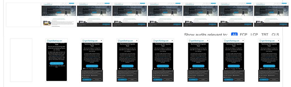
Improved Google Core Web Vitals:
For our website we did not use the primary background image on our mobile screen sizes and resolution. You can see that the primary image in the background is the largest contentful element visible on desktop but not visible on mobile devices. Using the correct media and imagesrcset attributes for preloading can significantly improve your website’s speed and performance.
Pass Google Core Web Vitals above the fold image preloading
Users have high expectations for fast and responsive websites, optimizing web performance has become crucial. Among various performance metrics, Largest Contentful Paint (LCP) holds significant importance as it measures the loading speed of the largest element visible on the user's screen. A slow LCP can negatively impact user experience and may lead to increased bounce rates. In this subect, we will delve into valuable tips to enhance your website's LCP and provide an optimal user experience.
Optimize Server Response Time
Reducing server response time is a fundamental step towards improving LCP. Evaluate your hosting solution and make sure it is robust enough to handle your website's traffic. Consider using content delivery networks (CDNs) such as CloudFlare to cache your content closer to your users and reduce response times.
Prioritize Critical Content
To achieve a faster LCP, it is essential to prioritize the rendering of critical content, such as main heading, images, or text above the fold. By doing this, users can start engaging with the most important parts of your webpage while the rest of the content loads in the background. Use tools like lazy loading, where content below the fold is loaded only when the user starts scrolling, allowing for quicker initial load times.
Optimize Images and Videos
Large image and video files are notorious for slowing down the LCP. Optimize your visual content by compressing images without compromising quality. Use modern image formats like WebP or AVIF for better file sizes. Additionally, lazy loading techniques, where images and videos are loaded only when they enter the user's viewport, can significantly improve LCP.
Minify and Compress Resources
Reducing the size of CSS, JavaScript, and HTML files can significantly enhance your website's load speed. Minify these resources by removing unnecessary comments, white spaces, and line breaks. Additionally, leverage compression techniques like Gzip or Brotli to further reduce file sizes without sacrificing quality.
Efficiently Load Third-Party Scripts
Third-party scripts, such as analytics, social media buttons, or chat widgets, can impact LCP if they take longer to load. Evaluate the necessity of each script and consider removing any that do not add significant value. Asynchronous loading or lazy loading methods should be implemented to ensure these scripts do not stall critical content rendering.
Utilize Browser Caching
By instructing web browsers to store and reuse certain files, you can reduce the number of requests made to the server and speed up subsequent visits. Leverage browser caching by setting appropriate cache-control headers or using cache plugins to extend expiration dates for static resources.
Monitor and Test Performance
Regularly monitor your website's performance using tools like Google's PageSpeed Insights, Lighthouse, or WebPageTest. These tools provide detailed performance reports, highlighting areas for improvement and suggesting best practices. Regularly test your website on different devices, browsers, and network conditions to ensure a consistent experience for everyone.
Optimizing Largest Contentful Paint (LCP) is crucial for providing a seamless user experience and reducing bounce rates on your website. By implementing the tips discussed above, you can significantly improve your LCP and enhance your website's overall performance. Remember, a faster loading speed not only benefits users but also positively impacts your website's search engine rankings, making it a win-win situation for your business.
Preloading images is a valuable technique used in responsive web design to optimize the loading speed and user experience of a website. In a responsive design, images often need to adapt and change based on different screen sizes or resolutions. Preloading images helps ensure that the correct image version is loaded swiftly when it's needed, reducing the perceived load time and avoiding visual glitches.
When a webpage loads, it typically requests and downloads resources such as HTML, CSS, JavaScript, and images. Without preloading, a responsive design might rely on media queries or JavaScript to load different image versions based on the device's screen size. This can result in a delay as the browser retrieves and renders the required image, leading to a slower website performance. To avoid this delay, preloading images involves loading the necessary image versions beforehand, anticipating the different sizes or resolutions that will be required. By doing so, the browser already has the images readily available when they're needed, allowing for a smoother and faster user experience.
There are different approaches to implement image preloading in a responsive design:
CSS background-image
One method is to use CSS to preload images by setting the relevant background-image properties to the required URLs. By including these preloading styles in the head section of the HTML document, the browser can start downloading the images while parsing the rest of the page.
JavaScript
Another approach involves using JavaScript to preload images. You can create an array of image objects and assign the appropriate source URLs to them. By executing this JavaScript code early in the page's loading process, the browser starts downloading the images in the background.
Lazy-loading libraries
In some cases, implementing a lazy-loading library can provide preloading functionality as well. These libraries allow you to load images as they become visible within the viewport, but they often have preloading features built-in to ensure a smooth experience when those images need to be displayed.
It's important to note that preloading images should be used judiciously to avoid negatively impacting the overall performance of the website. Preloading too many images or large file sizes may consume excessive bandwidth and slow down the initial page load. Therefore, it's crucial to strike a balance between preloading essential images and considering the overall page size and network conditions. In addition, reloading images in a responsive design is an effective technique to improve the loading speed and user experience of a website. By anticipating and loading the required image versions ahead of time, preloading ensures that the correct images are readily available when needed, reducing delays and optimizing the overall performance of the website.
To learn more about how we can help your company improve its rankings in the SERPs, contact our team below.

Bryan Williamson
Web Developer & Digital Marketer
Web Developer & Digital Marketer
Digital Marketer and Web Developer focusing on Technical SEO and Website Audits. I spent the past 26 years of my life improving my skillset primarily in Organic SEO and enjoy coming up with new innovative ideas for the industry.